Adding text over an image is a really effective way to communicate a specific message to your audience. Businesses and organizations have been doing this for a long time, and now everyone on social media is doing it too.
Text overlays work best on areas which have little detail or variation (negative space) so it stands out clearly, but sometimes your photos won’t have this kind of space.

If you encounter this problem, you could add a colored or semi-transparent block to use as the backdrop for your text. However, this will cause the imagery in your photo to take a back step.
It’s much better to allow your text and imagery to coexist. You can achieve this by increasing the amount of negative space above, below, next to, or in the center of the image, and we’ll show you how.
Add text at the top of your photo
We will start with the easiest location for creating negative space: the top of the image.
Why is it the easiest? It essentially boils down to gravity. If you look outside, you can see the ground, you can see objects on the ground, and then you have the ’empty’ sky above it.
The sky is considerably less busy than the ground, which means we can manipulate it to create space for text and it won’t look awkward.
There’s a clear blue sky in the image below. Since the sky is free of detail, we can duplicate it and add it to the top of the image to increase the height and make space for adding text.
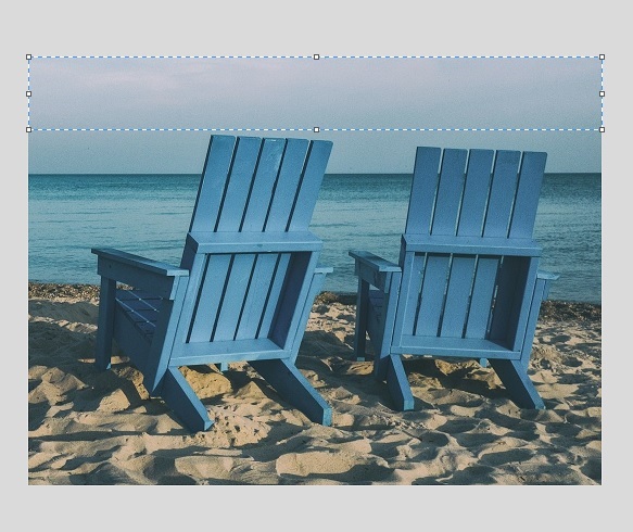
So, let’s select a block of negative space (the sky) and copy and paste it. Once we’ve pasted it, we need to flip it vertically so that it mirrors the top of the image and joins up nicely. We will add a further two duplicate blocks—three in total.
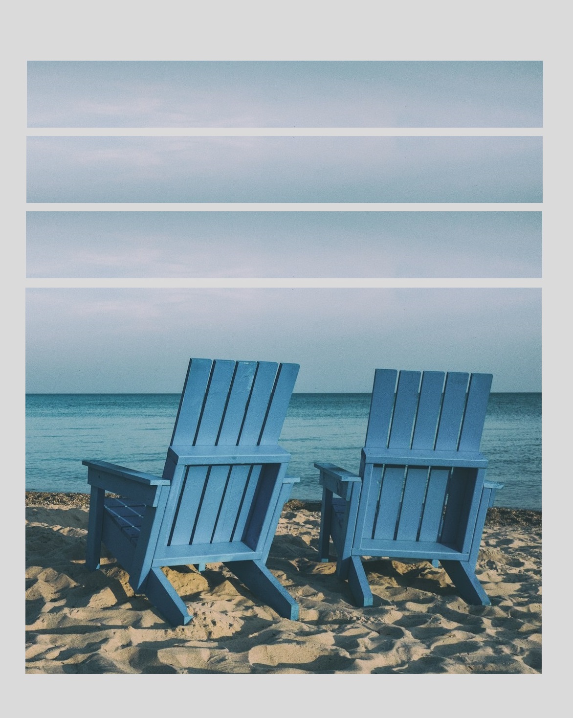
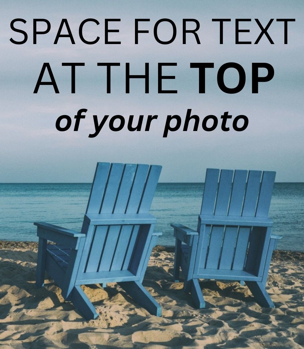
After stacking three duplicate blocks on top of the image, we have plenty of space for our text overlay. With this method, the text is naturally integrated with the imagery, which wouldn’t be the case if you tacked on a colored block.
Add text next to your photo
Just because creating space for text above the image tends to be the easiest approach doesn’t mean it can’t be done elsewhere.
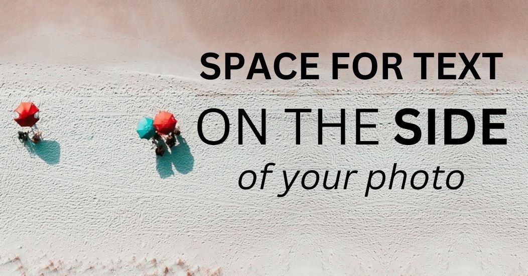
Sometimes you might find a suitable block of negative space on either side of the subject of the photo. In this bird’s eye view of a beach, there’s potential for expanding negative space to the right of the beachgoers.
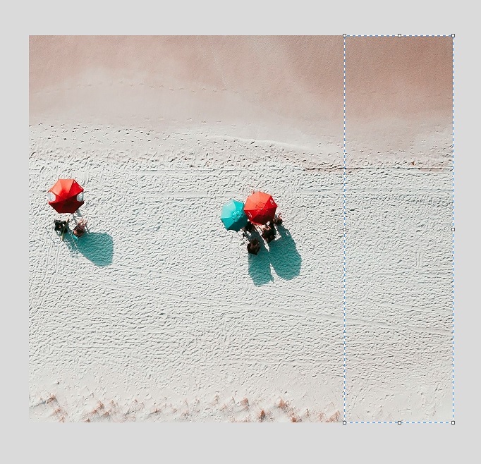
It’s not completely free of detail or variation, since the texture of the sand is visible, but it still counts as negative space and will be fine for our purposes. The main thing is that there isn’t anything too distinct (unlike the people under the umbrella).
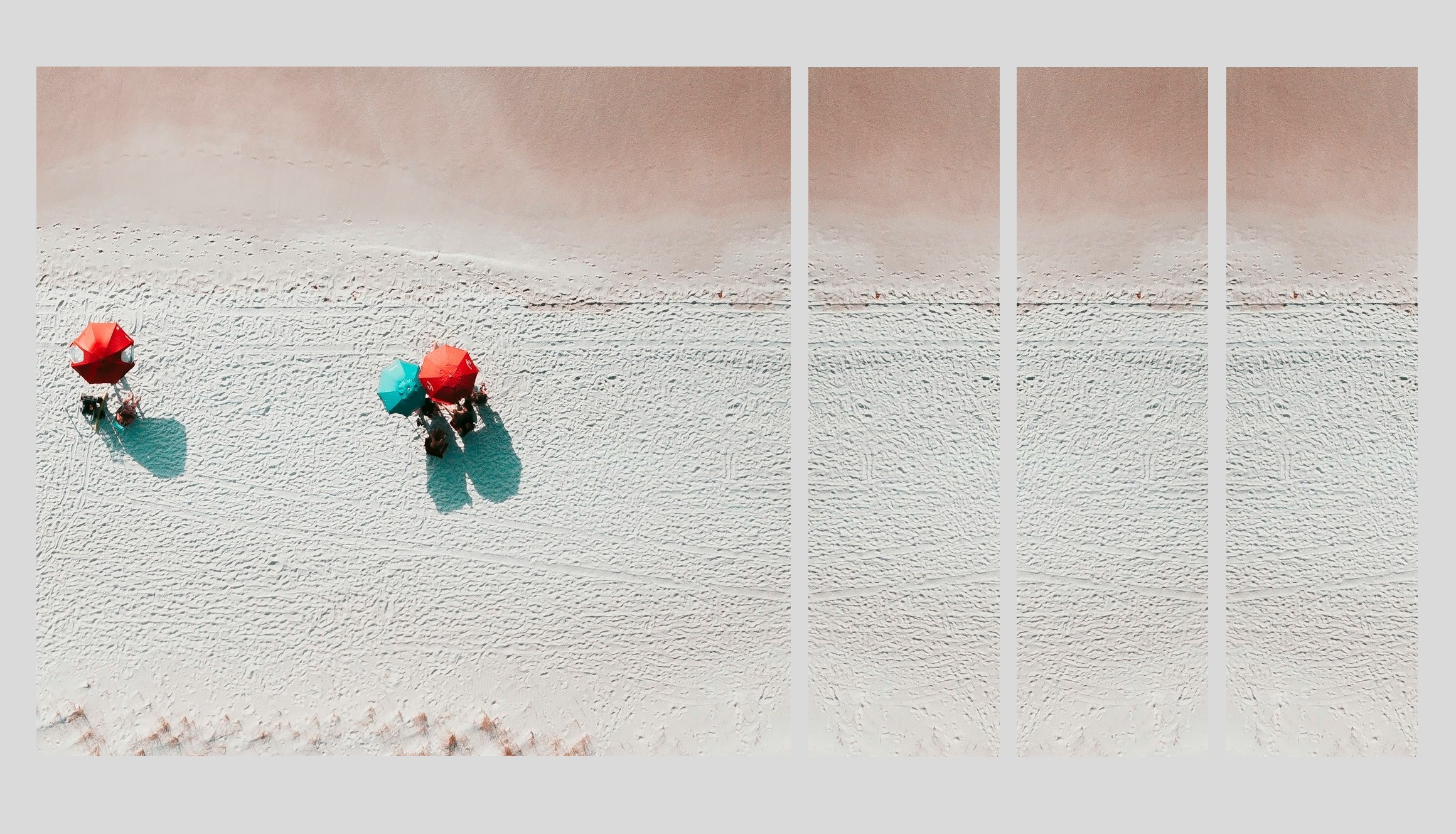
After following the same steps as the previous method, but using vertical blocks and flipping them horizontally, we increased the width of the photo and ended up with a wide open area for our text.
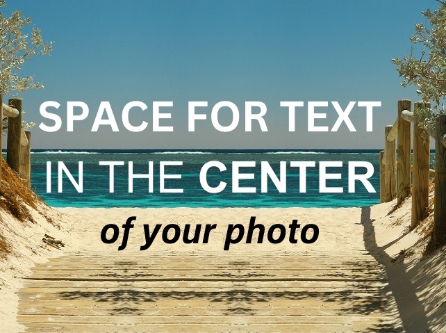
Add text to the center of your photo
This is probably the least likeliest area for creating negative space for text overlays—the middle of your photos tend to be the busiest parts! But you never know.
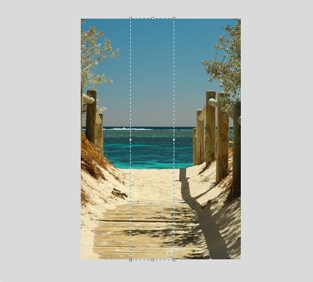
Let’s you say you have an image with little detail or variation in the center, just like in the picture above. Again, we need to select our block of negative space and copy and paste it a few times, while remembering to flip every other block.
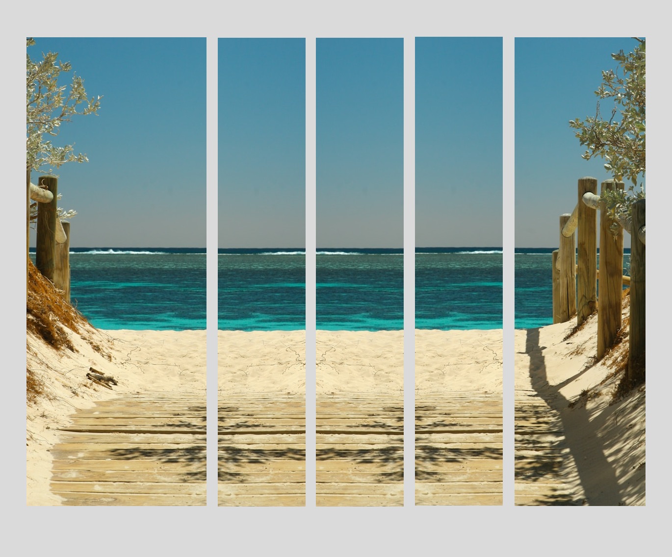
We also need to split the image into two so that we can insert our duplicate blocks between them. The end result is a photo with a wide open area in the center for adding our text.
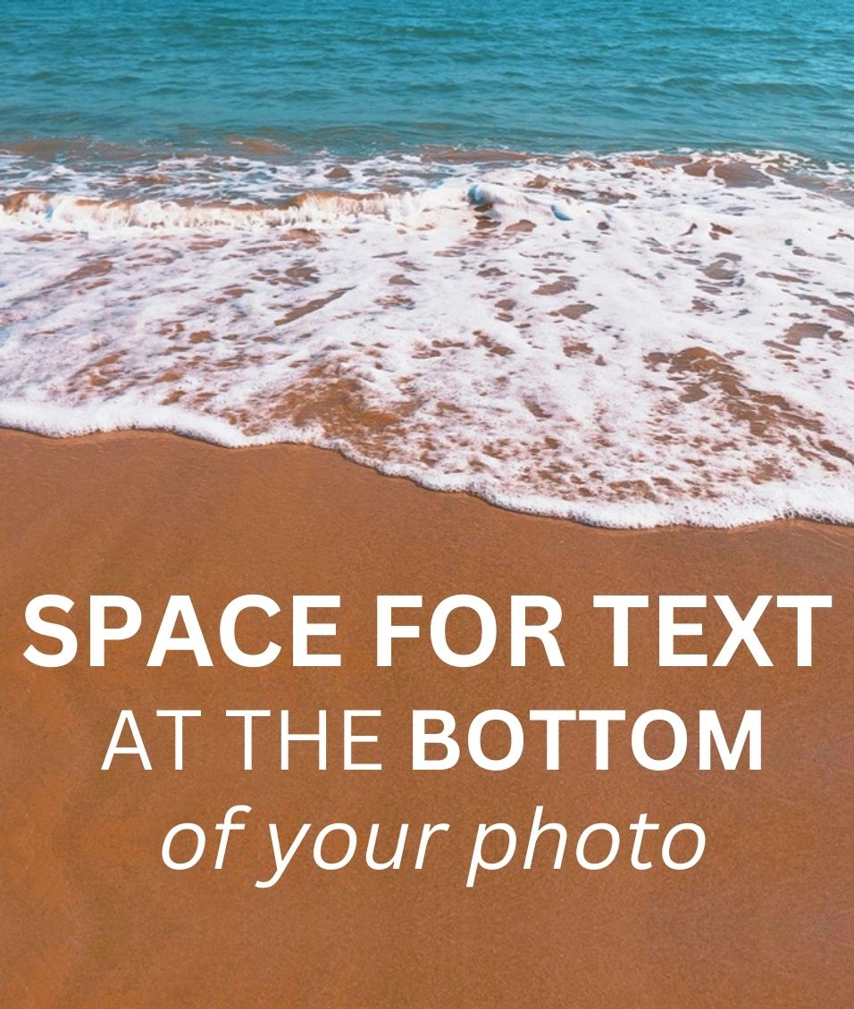
Add text to the bottom of your photo
The bottom of an image is probably the second easiest location for making space for adding text, which is good news since this is a very popular location for text overlays.
We’re just going to head in the opposite direction of the method for adding text at the top i.e. expand downwards. In the case of the photo below, we’ll duplicate the sand.
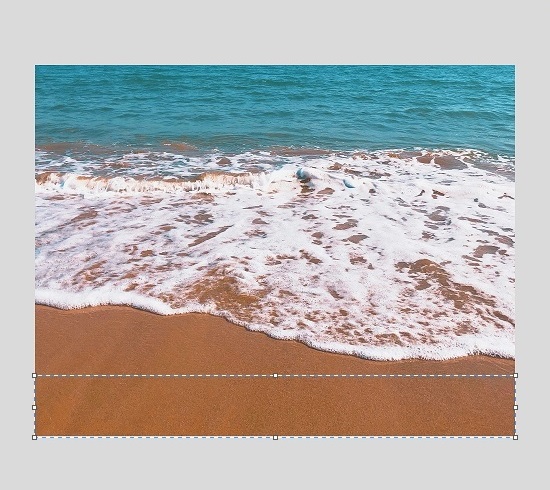
We are going to add three duplicate blocks, but you can add as many as you like on your own photos, depending on how much space you require. Just keep in mind the photo could lose its sense of realism if you expand too far.
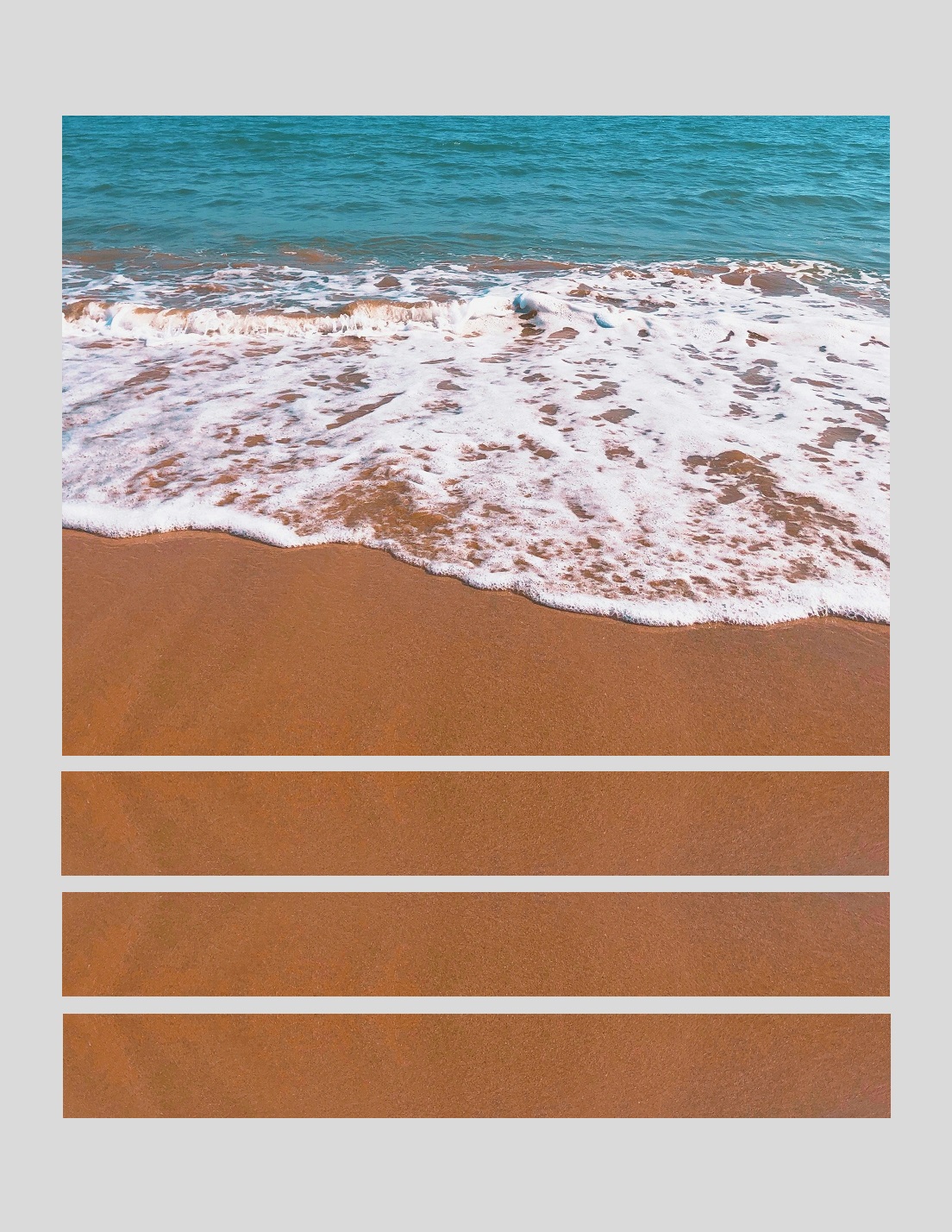
With all the blocks in place, we are left with a bottom-heavy photo that’s primed for some beautiful typography.
Summary
Rather than giving a piece of text its own background that’s separate from the imagery, you can achieve a more professional and cohesive look by expanding the negative space.
Using duplicate blocks is the best way to go about creating space for text over a photo, and you can create this space pretty much anywhere you like as long as there are areas with minimal detail.